
You've spent a great deal of money on a digital marketing campaign - 5M Impressions, 100,00 clicks - Now What? Your audience needs to be compelled to stay, engage and convert doesn't matter if you're selling diamonds or chocolates. You can start out by mapping your users' personas, then feed them all the information you think they might need throughout their journey. The secret lies in understanding who you are dealing with and what measures you can take to persuade them to take action.
What is Persuasion Architecture?
Persuasion architecture is the method of guiding website users towards a conversion path by injecting visual and textual cues throughout the journey. There can be multiple paths laid down for every recognized persona or a single path for the specific audience you are targeting.
The experience throughout the conversion funnel needs to be fluid every step of the way. When it comes to e-commerce, decisions are made in milliseconds which is why smooth and quick navigation experience should be the soul of your website.
A Persuasive Conversion Path Is Every Impulse Buyer’s Biggest Nemesis.
If you have events based tracking setup on your website, you can start analyzing what elements need prominence and which ones don't. Often times you will a see website where it might take you a second or two to notice the call to action, this is either because the call to action is too dull or everything around your CTA is too distracting, taking away its emphasis.
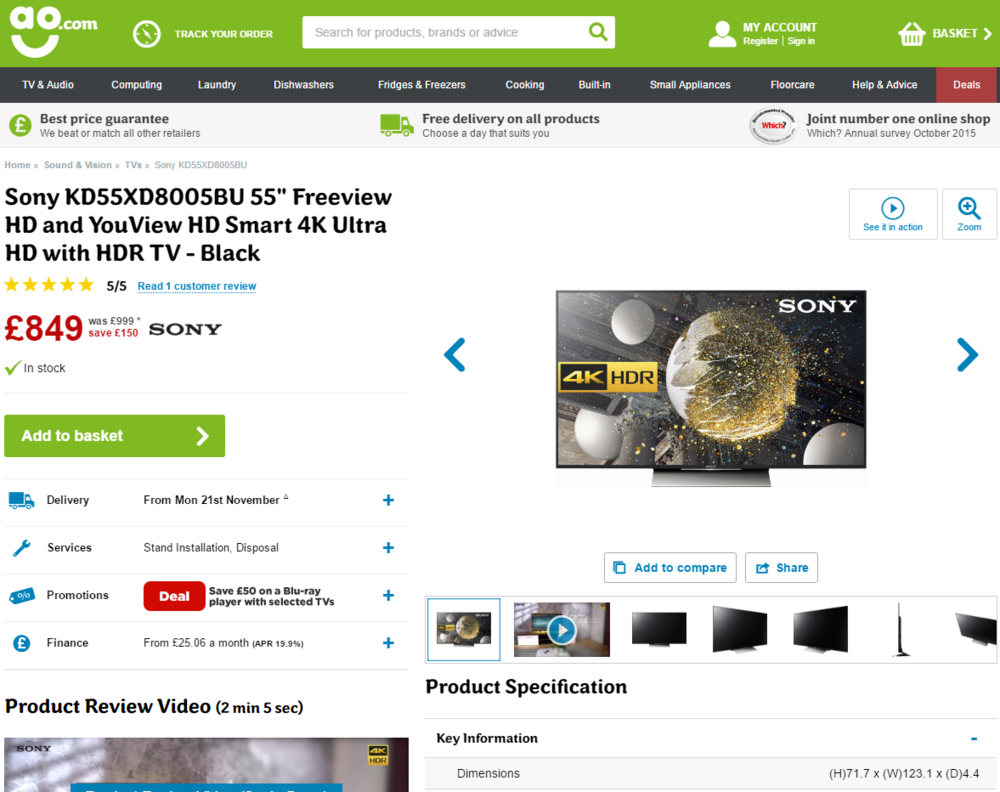
Here are two example's - Let's say you're in the market to buy an Ultra HD TV, you have two tabs open in your browser and this is what your fold ( view without scrolling down ) looks like. Right off the bat your notice the CTA on ao, notice how they only use the green for the header and the call to action. Nothing else. That intensifies the call to action and makes it that much more appealing, right in your face.
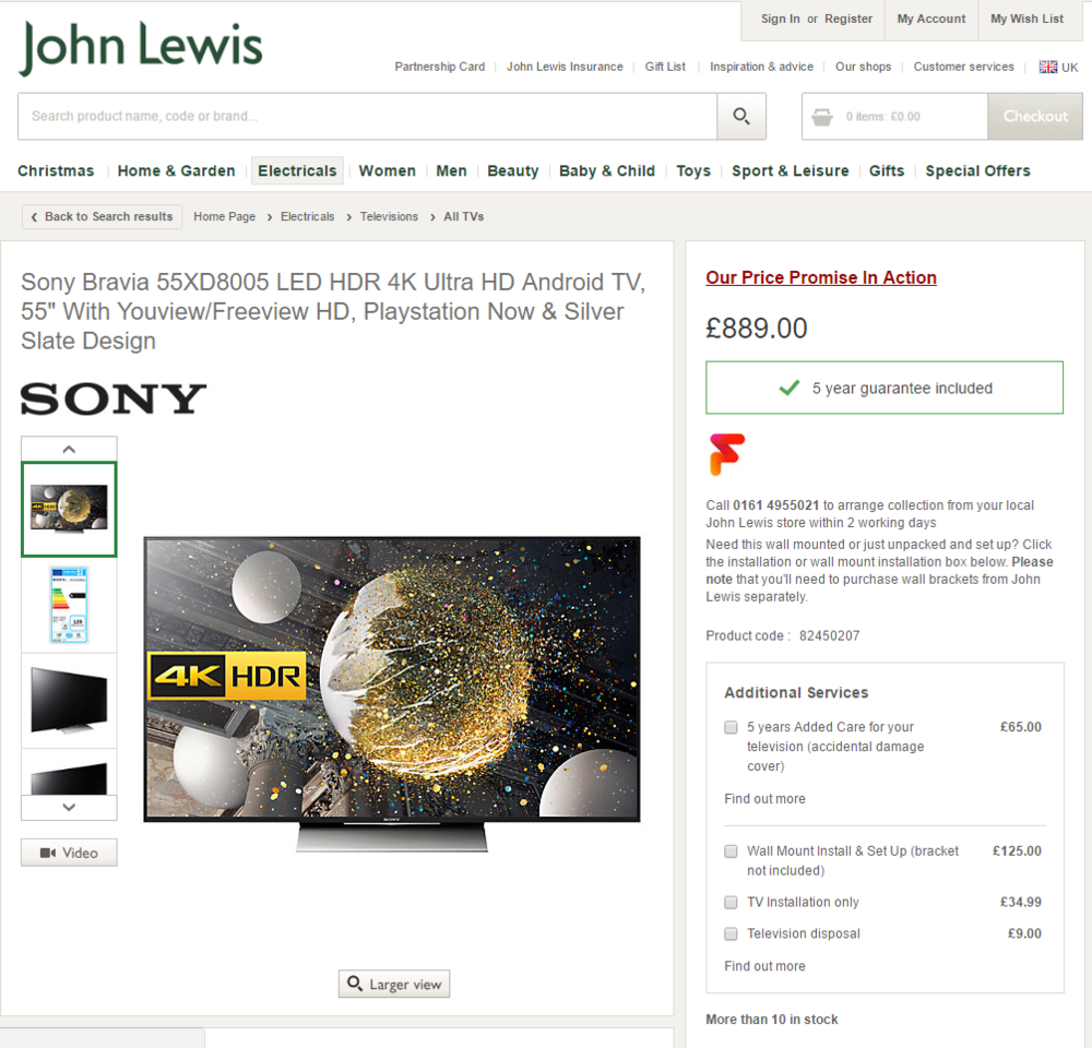
Here's a quick exercise for your brain. Look at the ao.com image or better yet visit their website right now and blink a few times while staring at it. You will notice those 2 green's hit your retina's each time much before your brain absorbs the information on the screen. Now if you look at John Lewis, their call to action is green as well, but you can't find it can you? That's because it's below the fold, perhaps their designers were using 5K iMacs that are 3X the resolution and forgot to test it out on a standard laptop? I don't know, seems like a significant oversight but let's give them the benefit of doubt and assume they tested it out and this works for them.
If you're able to get in your customers' shoes, you will begin to understand what really matters to them and what doesn't.
Let's say you have a fantastic infographic describing the process of claiming warranty in the event your customer's device is faulty. Where would you as a persuasion architect place this infographic for maximum m impact? Choose wisely!
- Homepage
- Category Page
- Product Page
- Shopping Cart
- Post Purchase Email
It would make sense to make it available only to high intent users, potential customers on the product page who are considering buying your product.
In a nutshell, this is what's happening in the user's frontal lobe as they scroll through the page looking at images, price, features, specs, etc..
Price ✔
Product Information ✔
Reviews ✔
Shipping ✔
Payment Options ✔
Warranty ???
At this point in the conversion funnel, when the user is most likely to buy, they see a glimpse of the infographic that says "Warranty - Don't you worry about that" floating on the right of the product page as a pop-in banner with a see more button at its bottom. Just an idea - don't shoot me, UI designers.
Content marketing is the art of building a narrative around a campaign, a storyline if you will. Persuasion architecture, on the other hand, dictates the where, how and when that content should be placed to get maximum response. A large part of persuasion architecture involves A/B testing different placements such as the position of the image gallery, price, and call to action buttons. It allows you to see how making small changes can have a significant impact on conversions.
The best experiences persuade users to continue the journey while removing barriers for further interaction. Persuasion architecture thinking allows us to deliver site experiences that lay a clear path towards purchase.