
What is a design system?
Design system is a collection of reusable components which serve as the building blocks of your application interface. It is a visual language that is maintained across every single customer touchpoint to enable brands to create a consistent user experience.
Your design system is whatever you deem worthy of standardizing. Whether its a simpler system with color palettes, combinations, and typography defined or something more complex such as layout, gestures, motion, and environments. It allows teams to design faster at scale by reusing and assembling elements for building websites and applications.
If you have one designer working on a project then you need not worry about design consistency but imagine multiple teams working on different components of the UI for multiple platforms. It will be impossible for these teams to maintain consistency unless they shared a visual language which not only enables them to design faster but also design efficiently.
Rise of DesignOps
With design becoming an integral part of the business, this new direction gave rise to a function within organizations who are responsible for managing and governing the design process. Their objective is to improve design efficiencies and generate more consistent work.
DesignOps evangelizes and builds a culture where design is not just another step but an integral part of the business.
Brands now understand the role of design in enhancing the user experience and the return on investment has become more obvious. That's the reason why you'll find at least a 4:1 ratio of developer to a designer at most matured organizations.
Shopify for example, allows developers to build apps which augments the functionality of the core platform. Apps such as Kit messenger, Yotpo Reviews, Algolia Search & SEO manager, gives Shopify users access to advanced functionality at the click of a button which would be very difficult to develop on their own. However, allowing these partners to develop apps that are supposed to function within the Shopify ecosystem created a visual disconnected in the user experience for Shopify customers.
That's when Shopify decided to invest in their design system - Polaris.
Polaris breaks down guidelines into the following,
- Content: Tone of voice, vocabulary, reading level and naming convention.
- Design: Colors, Typography, Illustrations, Sounds, Icons, Interactions and Data Visualization.
- Components: CSS, React and HTML components for building the frontend. It is is a huge library with reusable interface elements that can be used across the Shopify system.
- Patterns: It includes brand principles and defines what layout policies the app should adhere to.
Shopify should look good and feel like a world-class experience, but not for the sake of being pretty. Every aesthetic design decision—from how we design components, to illustrations, and choices about color—should be purposeful ~ Shopify Product Principle
Here are some more examples,
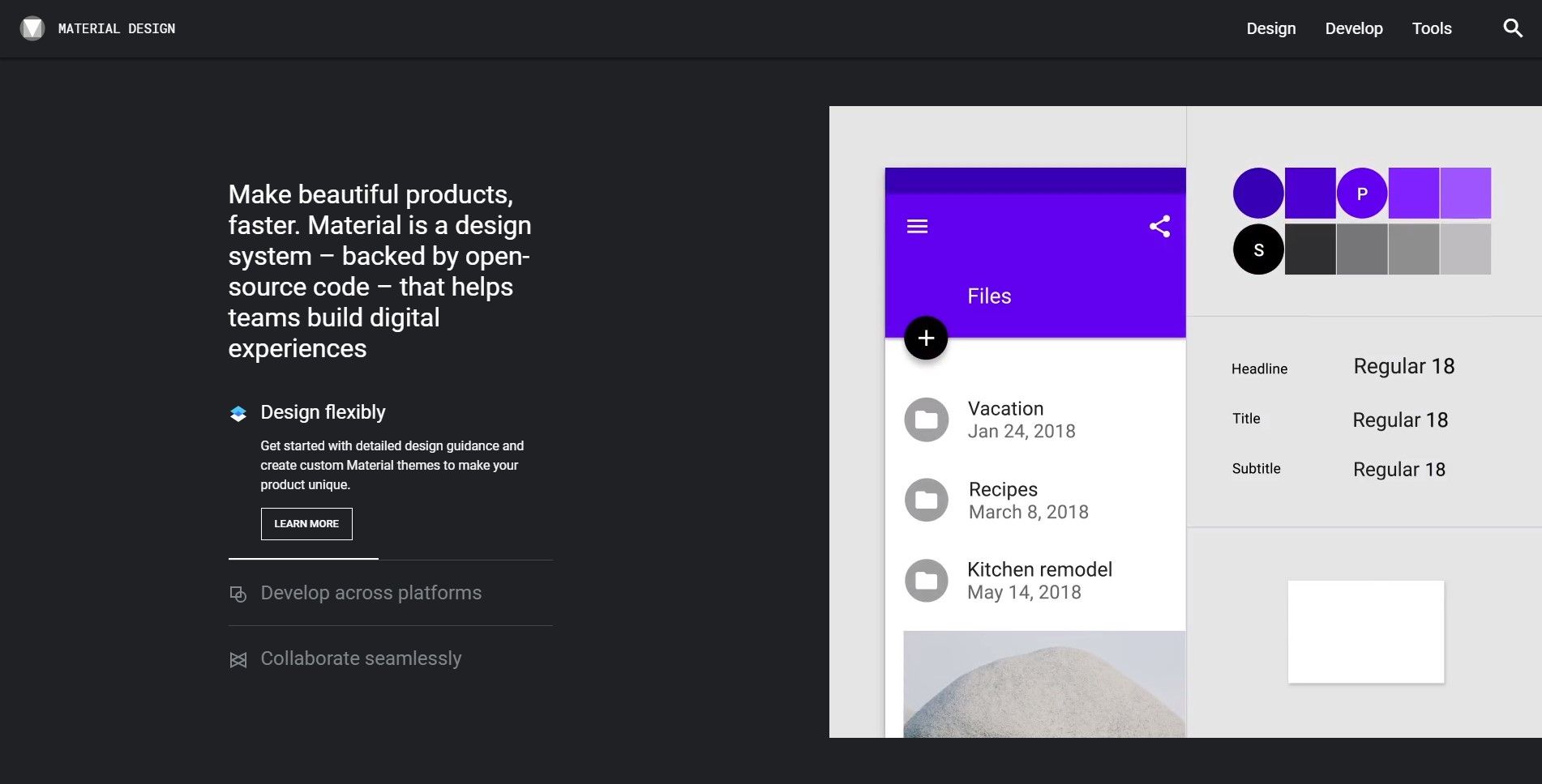
Material by Google
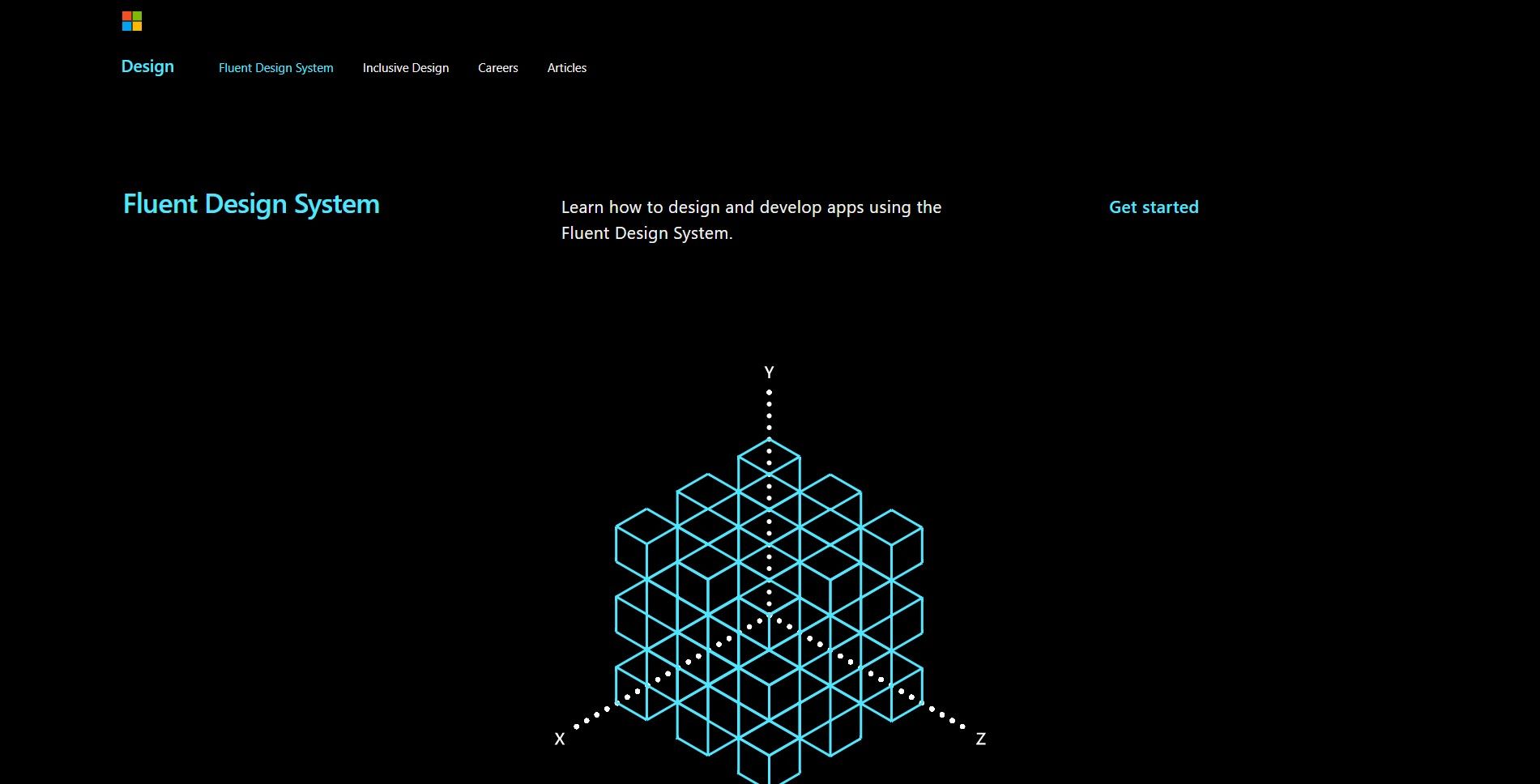
Fluent by Microsoft
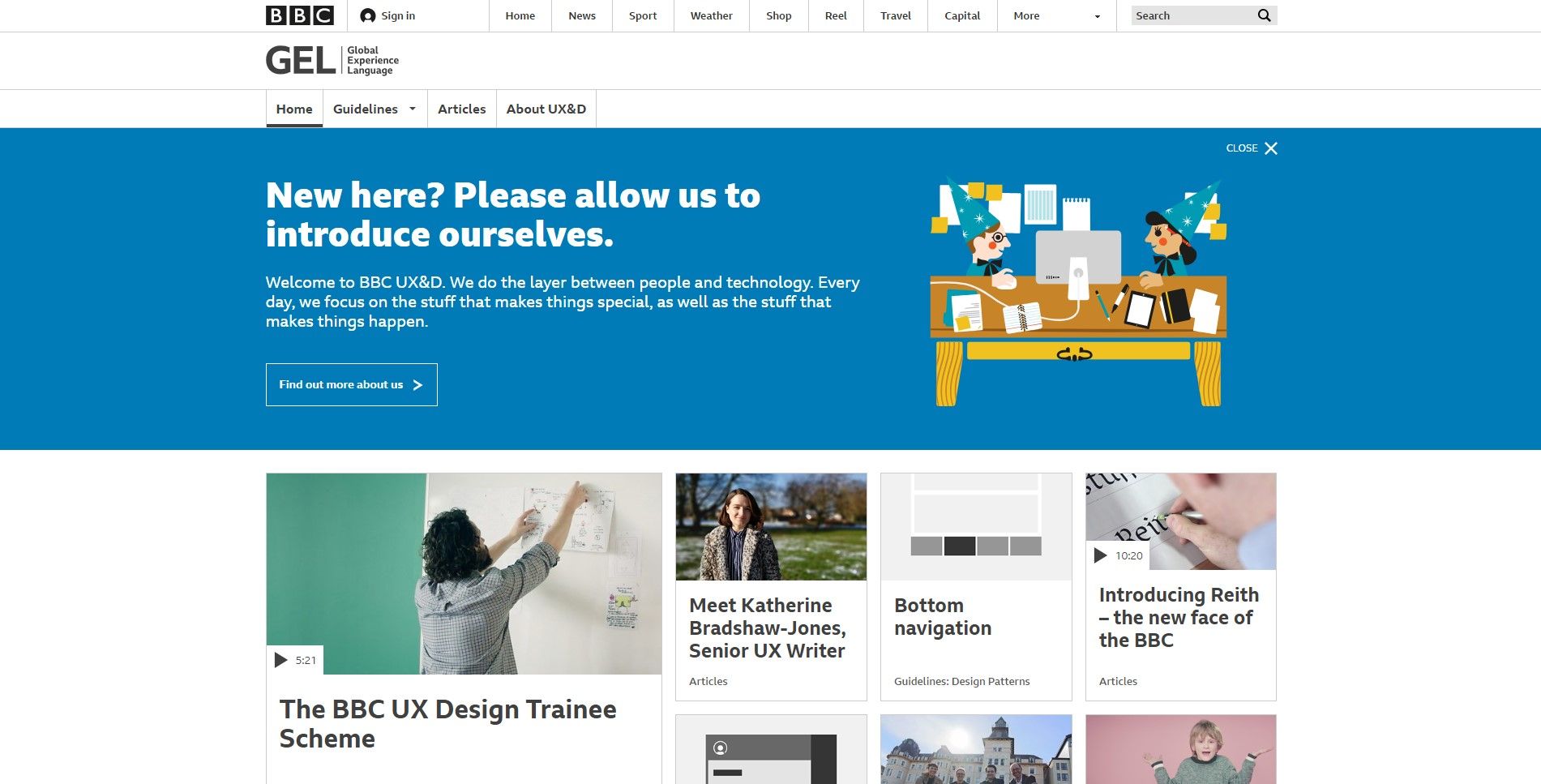
GEL by BBC
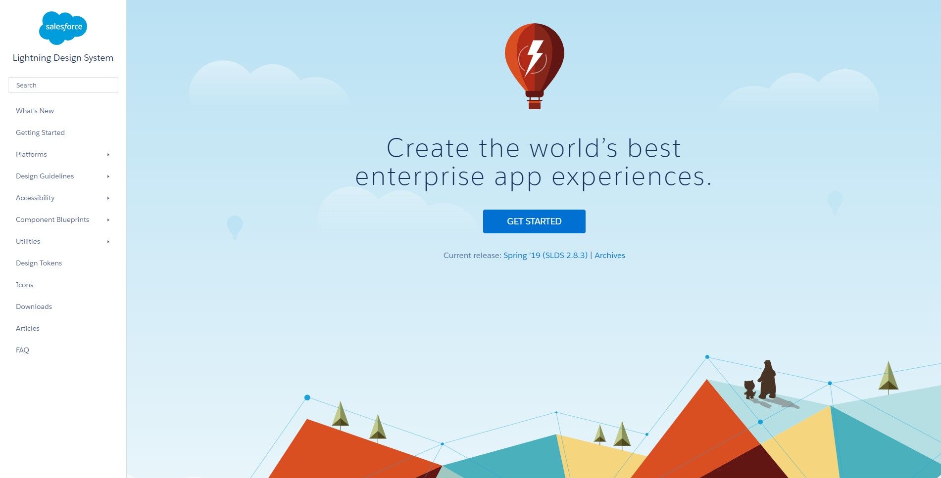
Lightning by Salesforce
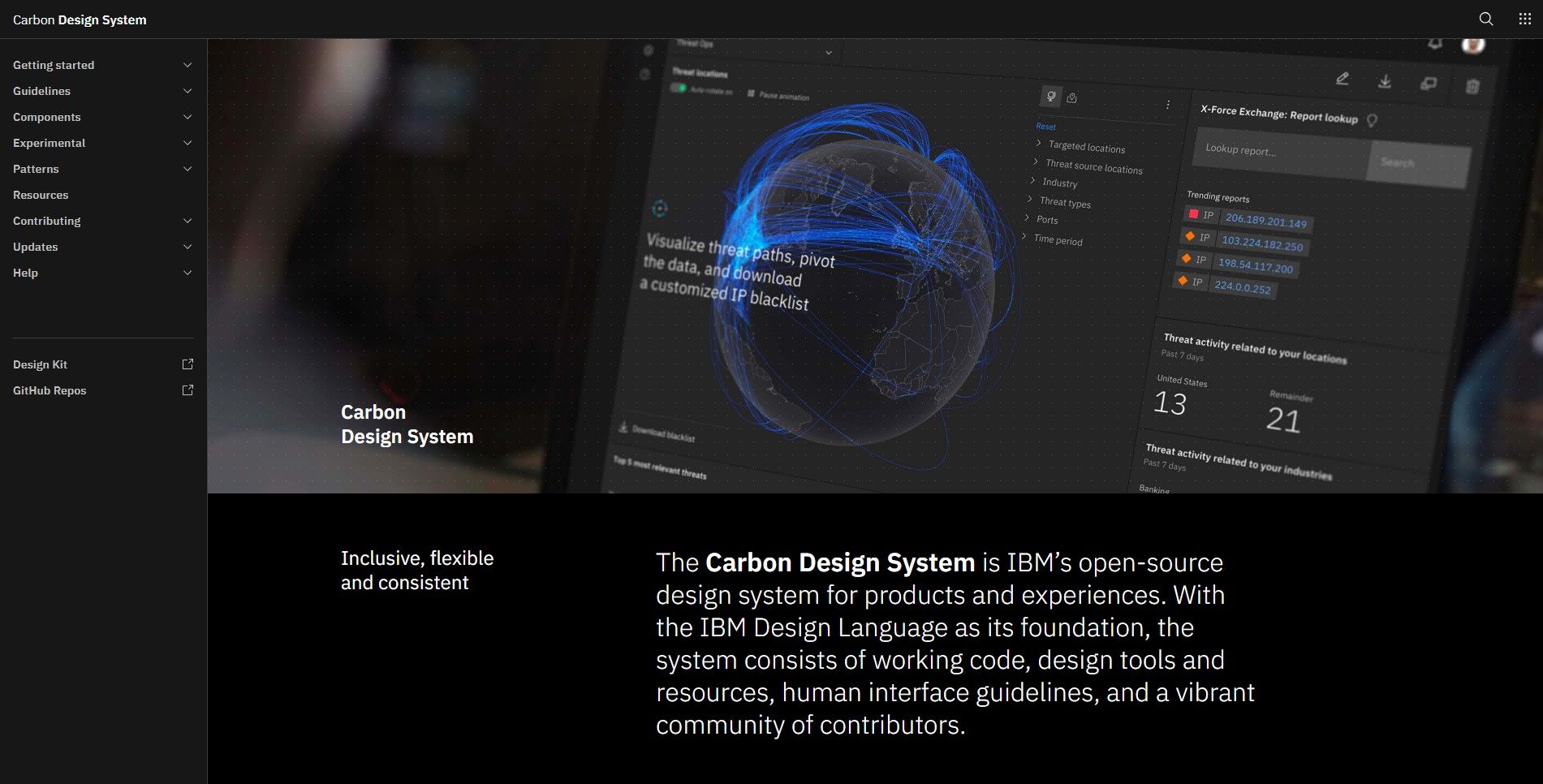
Carbon by IBM
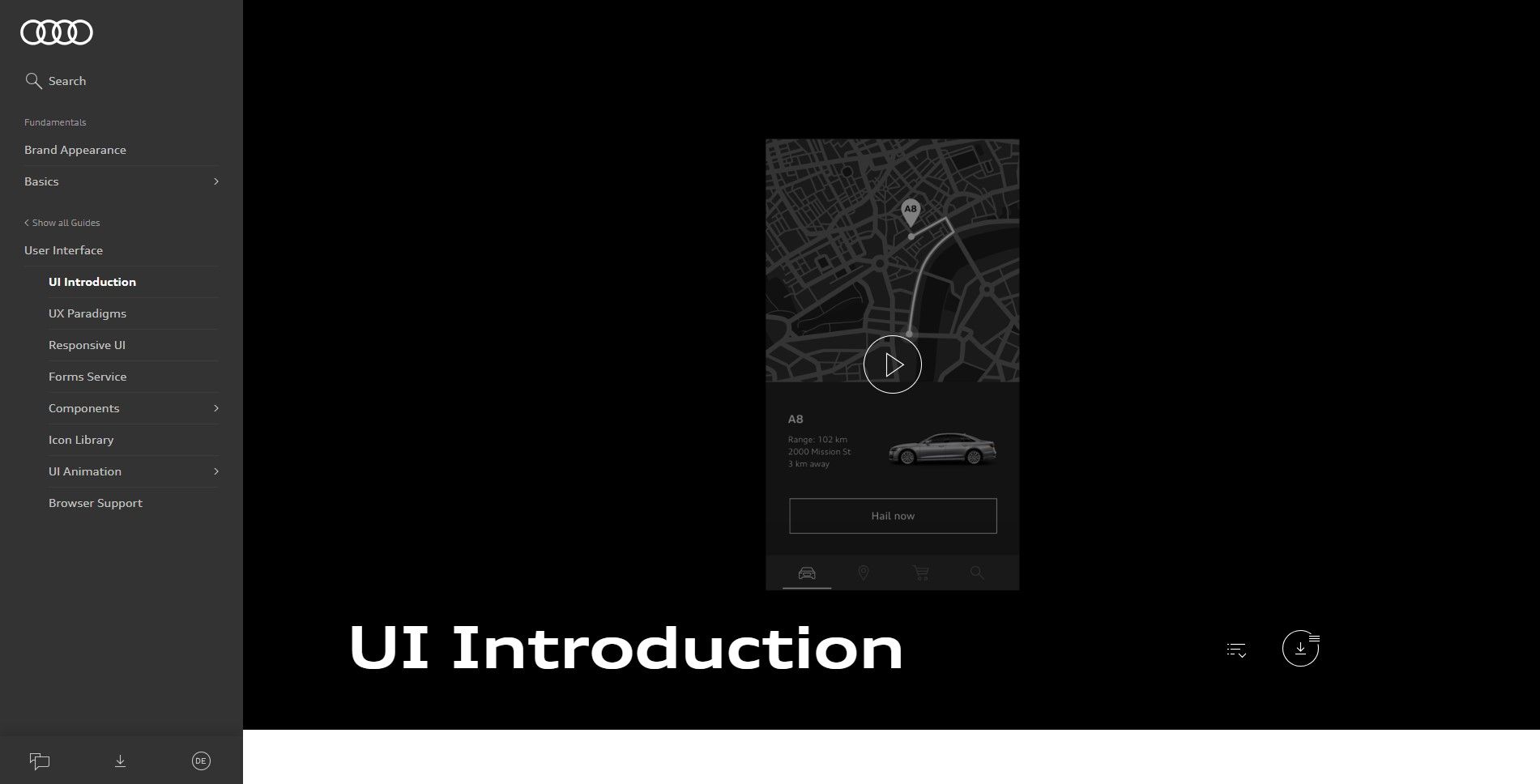
Audi UI by Audi
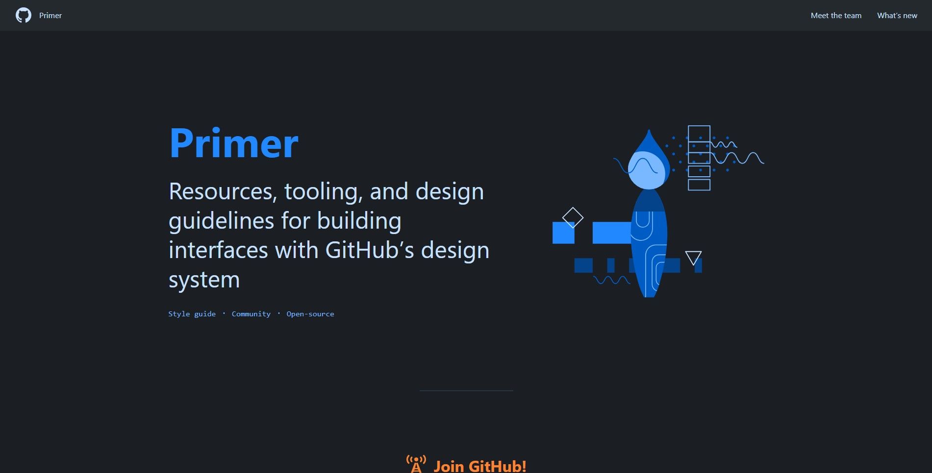
Primer by Github
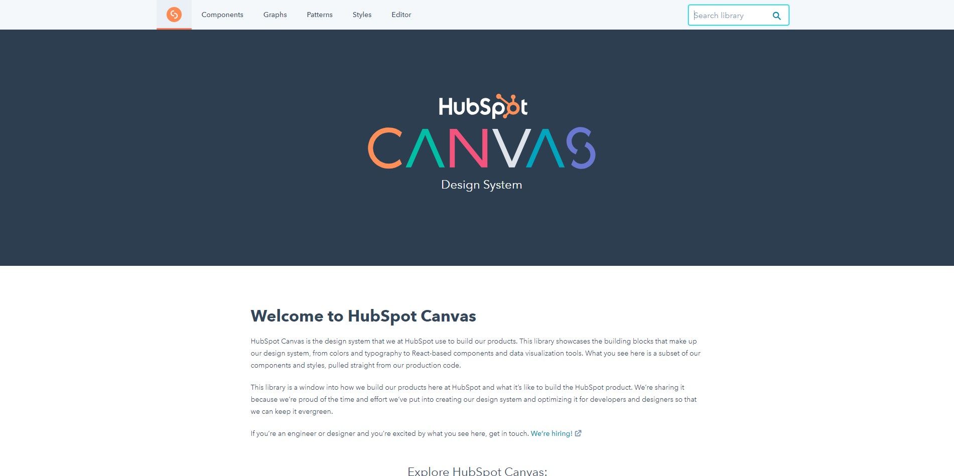
Canvas by Hubspot
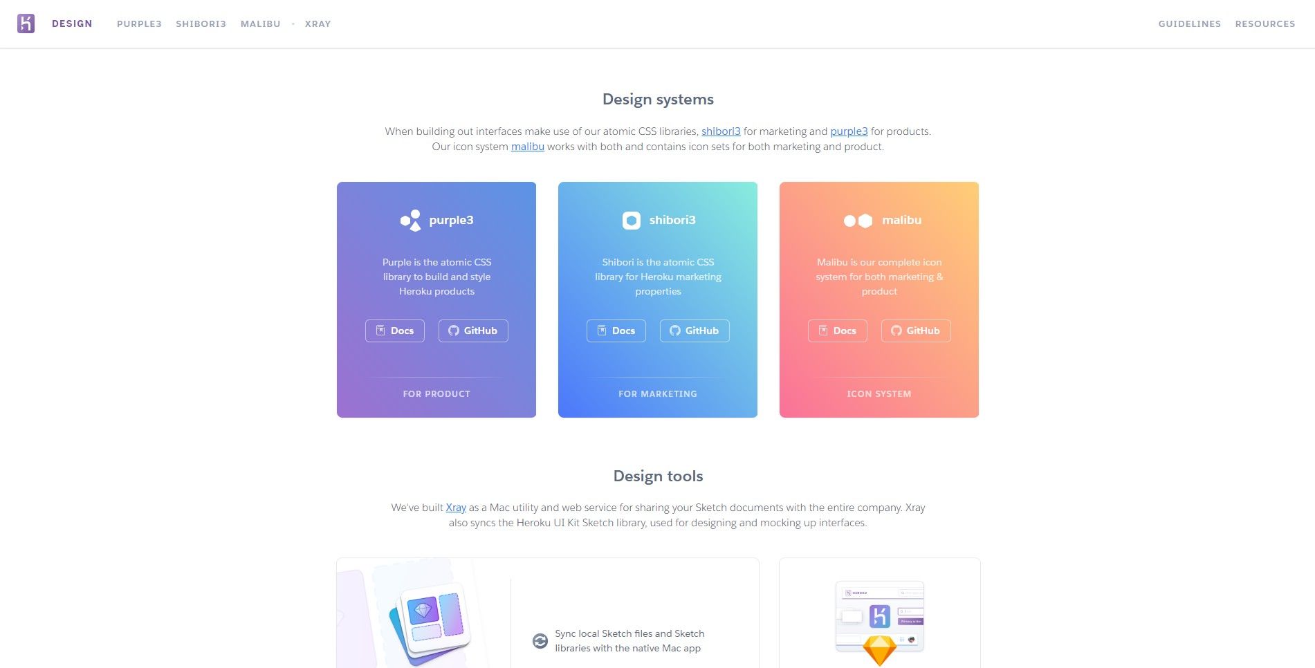
Purple3, Shibori3 and Malibu by Heroku
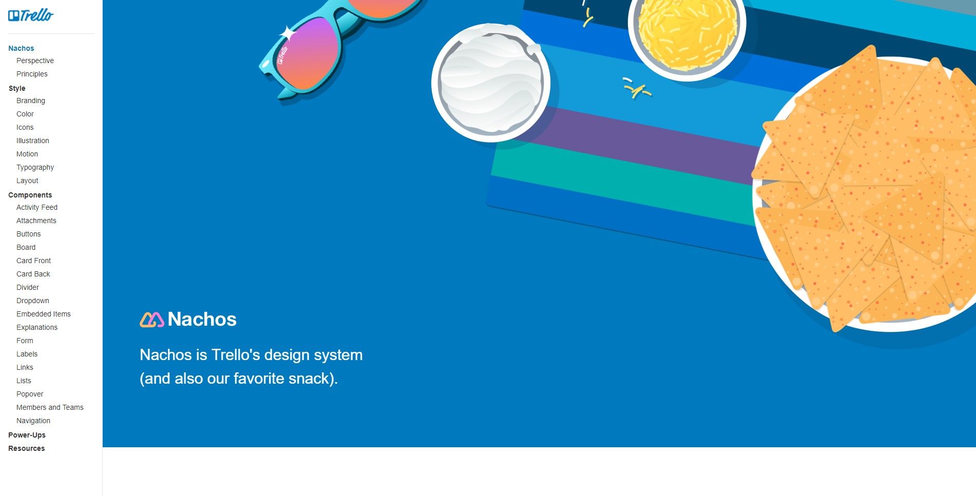
Nachos by Trello
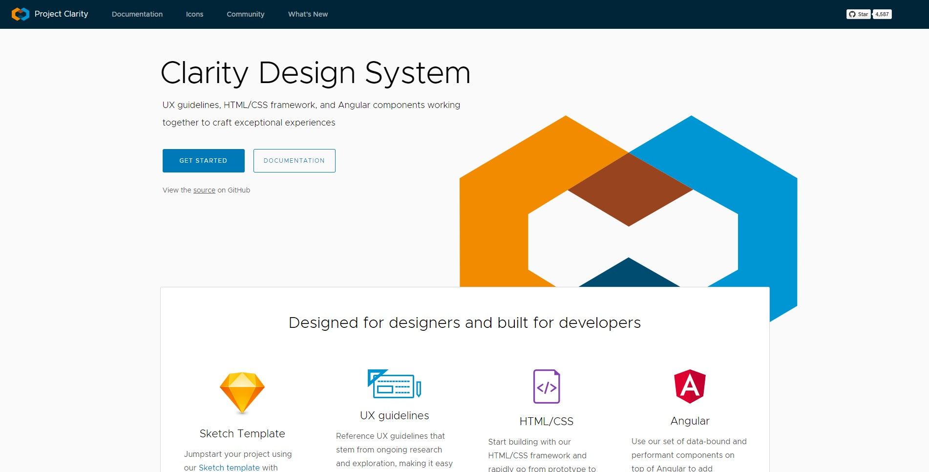
Clarity by VMware
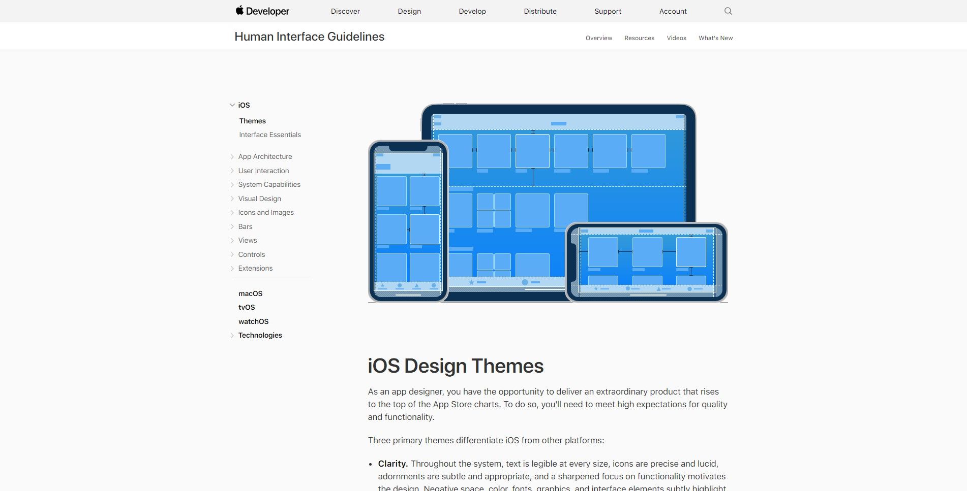
Human Interface Guidelines by Apple
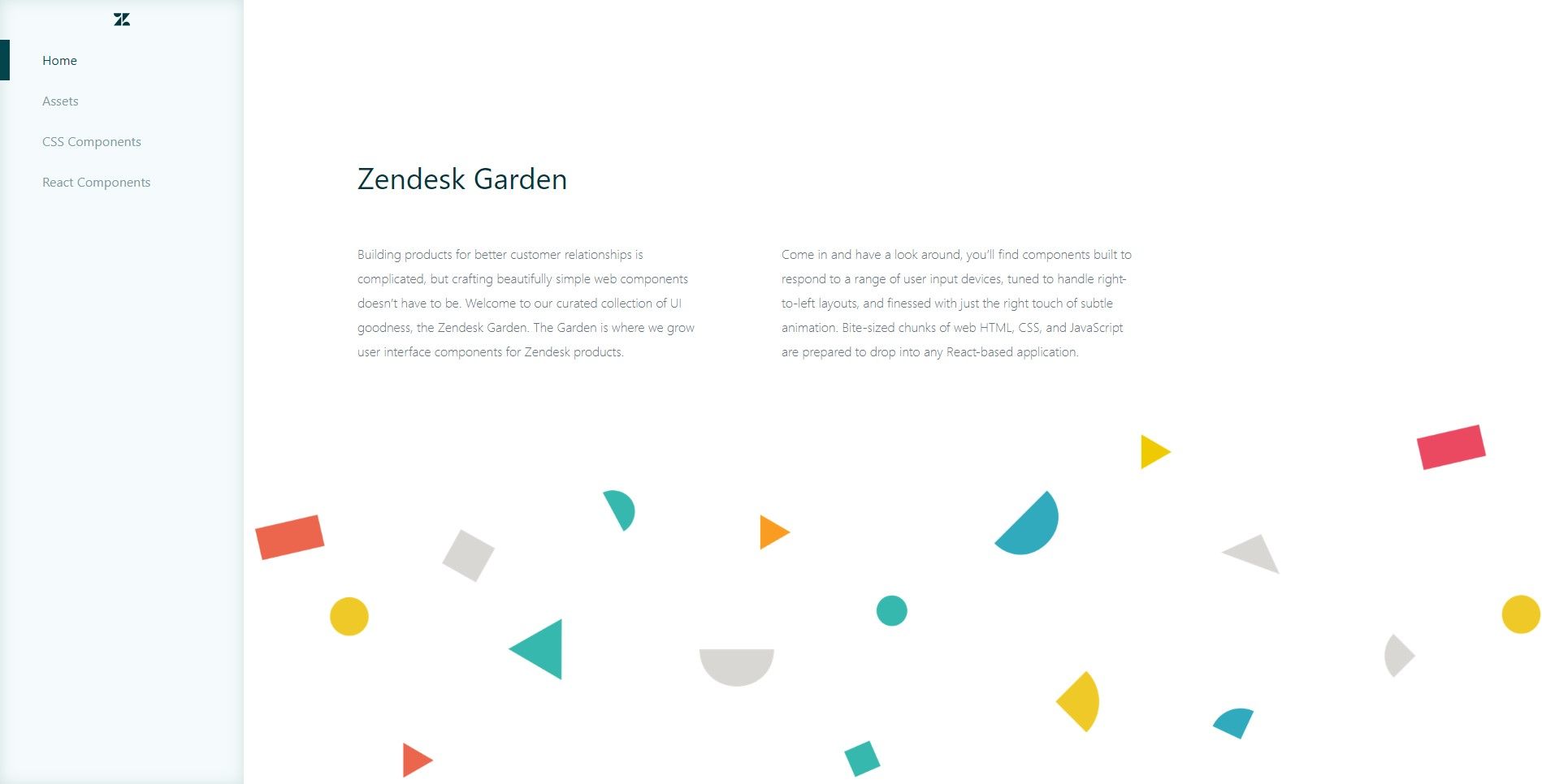
Garden by Zendesk
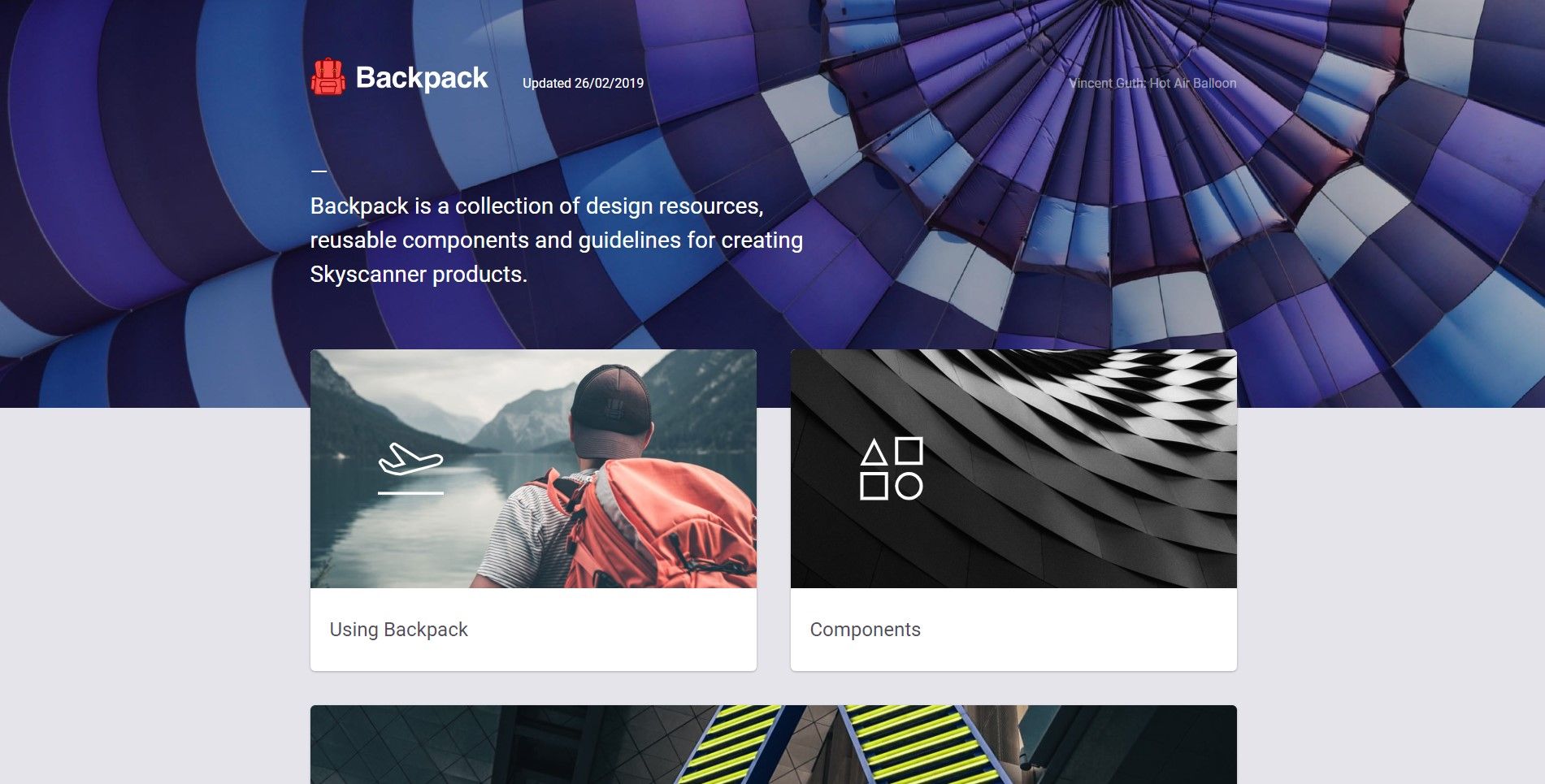
Backpack by Skyscanner
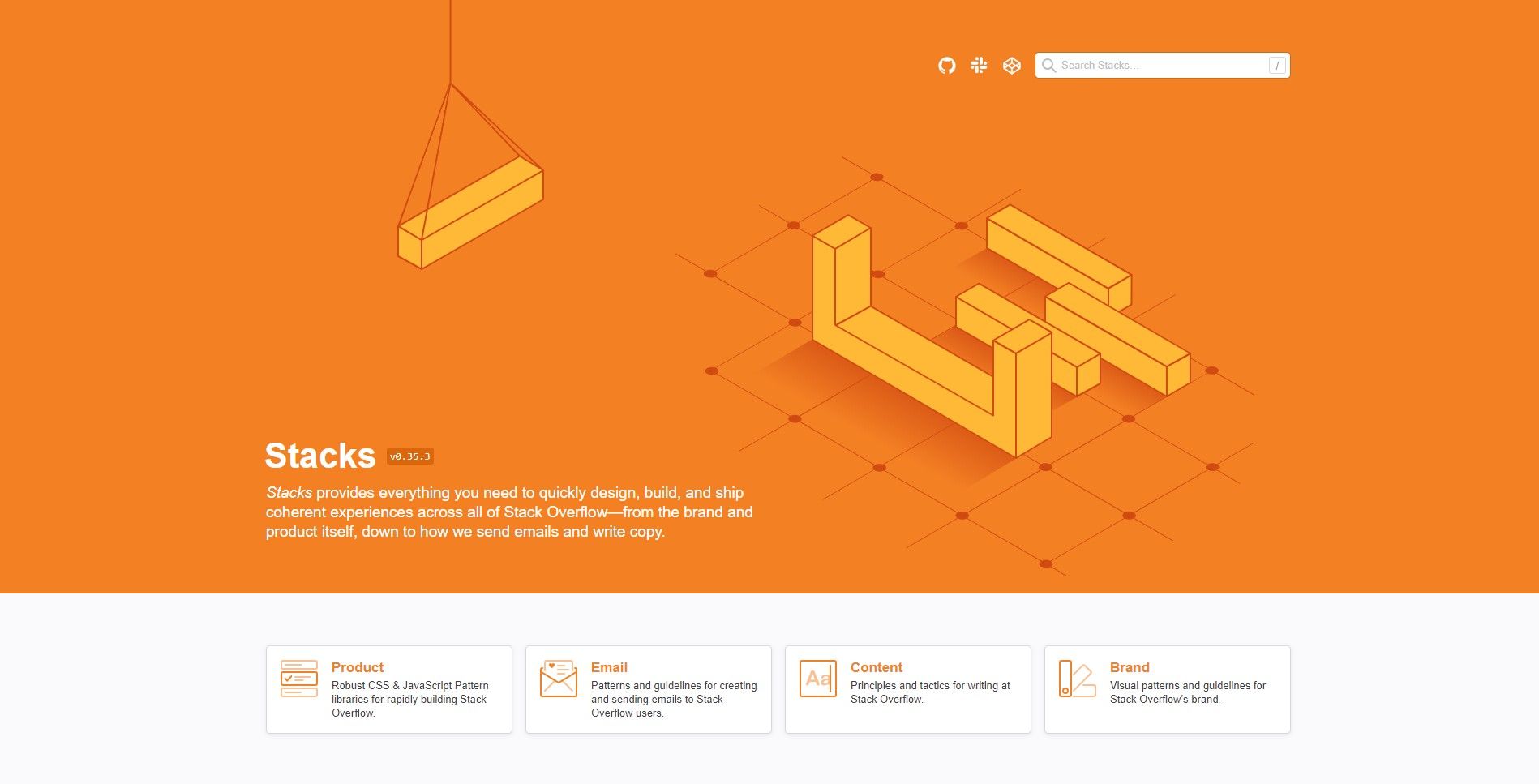
Stacks by Stack Overflow
Design systems, although require quite an investment and effort. It allows you to design consistently, prototype faster, iterate quickly and improve product usability.